Choosing the right UI framework or component library affects every visible part of an application and a large portion of the development time. This guide compares 10 leading UI frameworks and component libraries in 2026 across three dimensions that consistently matter for software decisions: the features each provides out of the box, how each performs under realistic load, and the use cases each fits best. Ext JS, Material UI, Ant Design, Chakra UI, and seven other options each have a place, with the right choice depending on whether the application is data-intensive enterprise work, a consumer product, or something in between.
Key Takeaways
- UI frameworks and component libraries solve different problems, and the right choice depends on whether the application needs application architecture, ready-to-use components, or both.
- Feature depth varies significantly, from comprehensive frameworks like Ext JS with 140+ components to focused component libraries that cover specific UI patterns.
- Performance differences become visible only under realistic load, not in demos, so proof-of-concept testing with actual data is essential.
- Accessibility under WCAG 2.2 is a baseline expectation in 2026 and varies dramatically across UI frameworks and component libraries.
- Use case fit matters more than popularity, because no single UI framework is best for every application.
Ext JS leads for data-intensive enterprise applications because it ships with the components that other stacks must assemble.
UI Framework vs UI Component Library: The Quick Distinction
Before comparing the 10 options, the distinction between UI frameworks and UI component libraries matters because the two solve different problems. A UI framework provides the foundational architecture for building an application’s interface, including state management, component lifecycle, routing, and rendering. React, Vue, Angular, and Ext JS are UI frameworks.
A UI component library provides pre-built UI components that work within a framework, such as buttons, forms, data tables, and navigation. Material UI provides components for React. PrimeNG provides components for Angular. Vuetify provides components for Vue. A few products combine both: Ext JS is unusual because it is a complete framework that also ships with 140+ built-in components, so teams using it do not need to choose a separate component library. The 10 entries below include both categories because most software development decisions involve evaluating them together, even though they answer slightly different questions.
How This Comparison Evaluates Each Option
Each of the 10 UI frameworks and component libraries is evaluated across three dimensions that consistently matter for software decisions. Features cover what the framework or library provides out of the box, including the depth of the component library, the kinds of components included, and the supporting capabilities such as theming and accessibility. Performance covers how the framework or library behaves under realistic load, particularly for applications that display large datasets or update frequently. Use cases cover the scenarios where each option fits best, since no single UI framework is the right choice for every project.
Rather than ranking the 10 against a single criterion, this guide treats each as a tool suited to specific scenarios. The comparison table at the end summarizes the differences across all three dimensions, and the decision framework after that helps match a project to the right option.
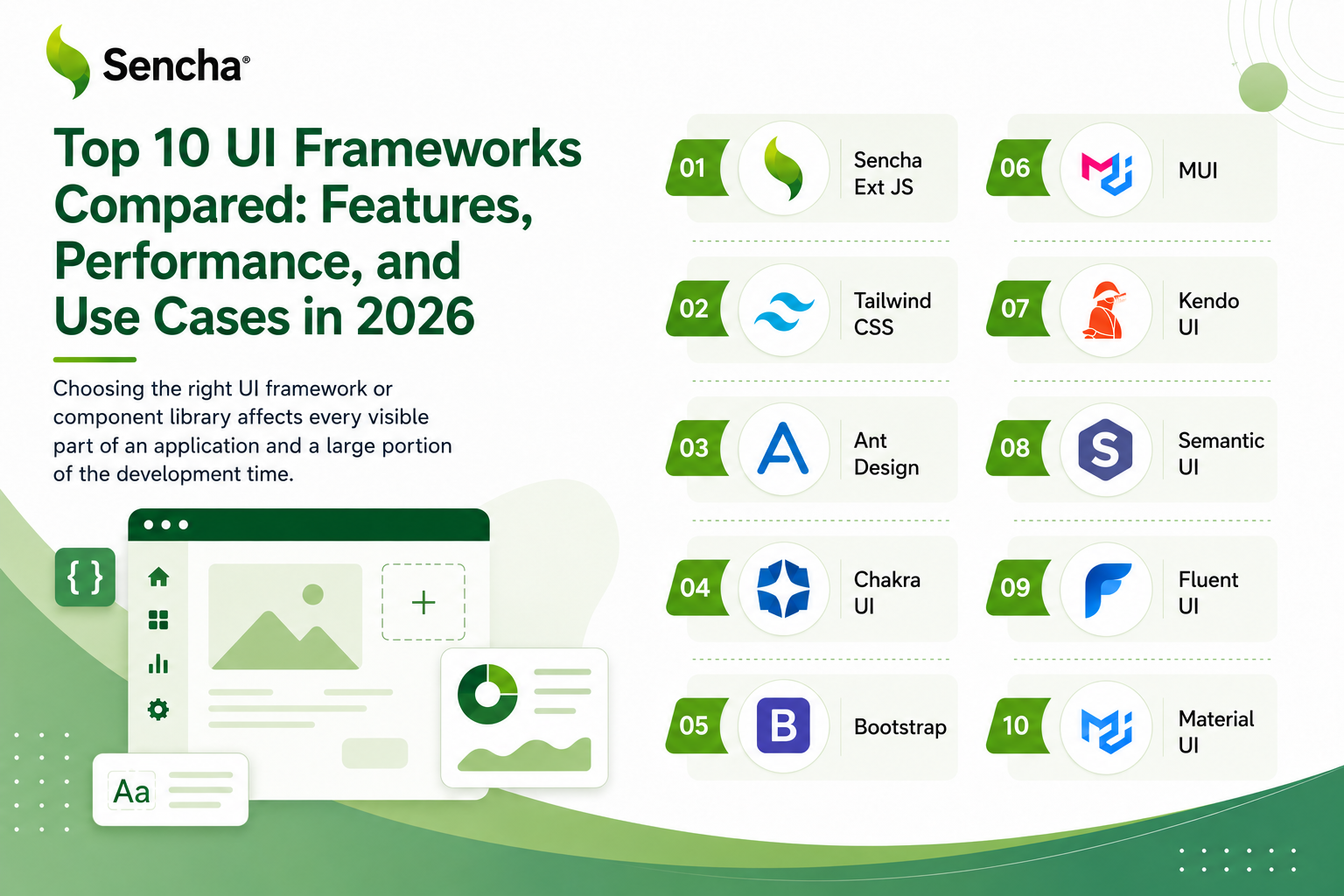
The Top 10 UI Frameworks and Component Libraries for 2026
1. Ext JS
Features
Ext JS is a comprehensive UI framework built specifically for data-intensive enterprise applications. We built it to ship with 140+ pre-built components covering every category an enterprise application typically needs: data grids with virtualization, charts, tree panels, calendars, forms with validation, gauges, pivot tables, and many others. Ext JS 8.0 adds a responsive Digital Signature Pad, a QR Code Reader and Generator, Font Awesome 7 as the default icon set, and ARIA accessibility built into the Modern toolkit for WCAG 2.2 compliance. The framework’s data binding architecture, built around stores and proxies, makes integration with backend systems straightforward.
Performance
Performance is one of Ext JS’s strongest dimensions. The data grid handles very large datasets through native virtualization and horizontal buffering, with only visible cells rendered at any time. Memory usage stays stable through long sessions because the framework disposes of components and listeners correctly. For applications with continuous updates, the store architecture supports efficient propagation of changes to bound components without re-rendering entire screens on every tick.
Use cases
Best for data-intensive enterprise applications including financial trading platforms, manufacturing dashboards, healthcare management systems, financial analytics tools, and complex form-driven applications. The framework’s comprehensive component library and strong backward compatibility make it particularly well-suited to applications with multi-year lifecycles. For React teams that need access to Ext JS components without leaving React, ReExt provides a bridge that lets Ext JS components run inside an existing React application.
2. React (with component libraries)
Features
React itself is a UI framework that provides component architecture, state management, and rendering, but no specific UI components out of the box. Teams typically combine React with one or more component libraries to reach a complete UI stack. The flexibility is the framework’s defining strength: nearly any component library exists for React, including Material UI for Material Design, Ant Design for business applications, Chakra UI for custom design systems, and many others. Recent React versions added Server Components, automatic batching, and concurrent rendering features that improve performance for complex UIs.
Performance
React’s virtual DOM provides strong performance for typical UIs, but large data grids require specialized libraries such as ag-Grid or TanStack Virtual for virtualization. Memory and update efficiency depend significantly on the state management approach the team uses. With careful library selection and tuning, React applications can reach excellent performance characteristics for almost any scenario, but the assembly work is real and ongoing.
Use cases
Best for consumer-facing applications, content-rich websites, single-page applications, and teams with strong React expertise who are comfortable selecting and integrating component libraries. The ecosystem maturity makes React a safe choice for most general-purpose UI work, particularly when ecosystem flexibility outweighs the cost of integration.
3. Angular (with Angular Material or PrimeNG)
Features
Angular is a complete UI framework with built-in routing, forms, HTTP client, testing utilities, and a comprehensive CLI. The opinionated structure scales well across large teams. For components, Angular pairs with Angular Material for Material Design or PrimeNG for business-application-focused components. Standalone components have eliminated much of the NgModule complexity that earlier versions carried, and signals provide modern reactivity throughout the framework. TypeScript by default catches errors at compile time that would otherwise reach production.
Performance
Angular’s performance is generally good but requires careful optimization for large datasets. Change detection can become expensive in deeply nested component trees, and bundle sizes are larger than some alternatives, which matters more on mobile networks than on desktop. PrimeNG provides virtualization for data tables that handles moderate datasets, though for very large datasets enterprise teams often pair Angular with ag-Grid or similar specialized components.
Use cases
Best for large enterprise teams that benefit from structured architecture, government and regulated projects, and organizations standardizing on TypeScript across the engineering organization. The complete framework approach reduces the architectural decisions teams need to make up front.
4. Vue (with Vuetify or Element Plus)
Features
Vue offers an excellent developer experience with a gentle learning curve and intuitive APIs. The template syntax feels natural to developers with HTML and CSS backgrounds, and the framework’s reactivity system creates smooth, responsive interfaces with less boilerplate than some alternatives. For components, Vue pairs with Vuetify for Material Design, Element Plus for business applications, or Quasar for cross-platform development. Vue 3’s Composition API with script setup provides cleaner code organization for large applications.
Performance
Vue’s performance is on par with React for most applications, with smaller bundle sizes than Angular and efficient runtime characteristics. The reactivity system handles typical UI updates well, though very large datasets typically require third-party virtualization solutions. For mid-size applications, Vue’s performance is competitive with any alternative.
Use cases
Best for mid-sized companies, teams modernizing legacy applications, and projects that value developer experience as a primary criterion. Vue’s progressive adoption model is particularly useful for organizations modernizing existing applications gradually rather than rewriting at once.
5. Material UI (MUI)
Features
Material UI is a UI component library for React that implements Google’s Material Design specification. The library provides comprehensive component coverage including navigation, forms, data display, and feedback systems, with a design system that supports visual consistency across large teams. The customization system allows theme overrides at component and global levels, and CSS-in-JS styling supports runtime theme switching. MUI X, the commercial extension, provides advanced components including a data grid for larger datasets.
Performance
Material UI provides reasonable default performance but requires careful import management to control bundle size. Tree-shaking support keeps production bundles manageable when applications import only the components they actually use. The MUI X data grid handles moderate datasets through virtualization, with the Premium tier supporting larger volumes.
Use cases
Best for React applications aligned with Material Design, teams that benefit from a strong default design system, and projects where extensive customization is not a primary requirement. The library’s popularity ensures broad community support and ongoing maintenance.
6. Ant Design
Features
Ant Design positions itself as an enterprise-class UI design language and React component library. Originally developed at Alibaba, the design system prioritizes clarity and efficiency over visual flair, with information density and user productivity at its core. Components include sophisticated data tables with advanced filtering, sorting, pagination, row selection, and custom cell renderers. The ecosystem extends to Ant Design Pro for admin dashboard templates and Ant Design Charts for data visualization.
Performance
Ant Design’s table component handles moderate datasets well through built-in virtual scrolling, sorting, filtering, and pagination. Bundle size requires careful import management for production use, with tree-shaking essential to keep production bundles manageable. For very large datasets, Ant Design typically requires augmentation with specialized grid libraries.
Use cases
Best for business applications, internal tools, and dashboards where information density and consistency matter more than visual innovation. The comprehensive internationalization support, with many languages and right-to-left text rendering, makes Ant Design particularly suitable for globally distributed applications.
7. Chakra UI
Features
Chakra UI emphasizes developer experience through intuitive component APIs and strong TypeScript support. The framework prioritizes rapid development with a composable component architecture that follows atomic design principles, letting teams build complex interfaces by combining simple components. Accessibility is a core priority: components include ARIA attributes, keyboard navigation, and screen reader support by default, meeting WCAG 2.2 standards without additional configuration. The styling system provides consistent spacing, colors, and typography through design tokens.
Performance
Chakra UI is generally efficient for typical UIs, though its CSS-in-JS approach has some runtime overhead compared to compile-time CSS solutions. For most applications the overhead is acceptable, but applications with very high update frequencies may benefit from alternative styling approaches.
Use cases
Best for teams building custom design systems, applications with strict accessibility requirements, and React projects that benefit from a strong developer experience. The composable architecture suits projects where the team wants to build a unique design language rather than adopt an existing one.
8. PrimeNG
Features
PrimeNG provides one of the most comprehensive UI component libraries for Angular outside of Angular Material. The library offers multiple theme options including Material Design, Bootstrap, and custom business themes, with components that emphasize functionality and data density. Data visualization components are particularly strong, with advanced charts, data tables, and dashboard layouts that suit business intelligence applications. The library includes specialized components such as rich text editors, file upload with drag-and-drop, advanced calendars, and tree components with lazy loading.
Performance
PrimeNG’s data table supports virtual scrolling, column resizing, and export functionality for moderate datasets. The library provides strong TypeScript support and follows Angular’s conventions for dependency injection and change detection. For very large datasets, PrimeNG performs well but may benefit from pairing with specialized grid libraries when working with hundreds of thousands of rows.
Use cases
Best for Angular applications that need rich data components beyond what Angular Material provides, business intelligence and reporting applications, and teams that want a single comprehensive library covering most enterprise UI needs.
9. Mantine
Features
Mantine combines a comprehensive UI component library with strong developer experience. Built-in dark mode, form validation, and notification systems reduce external dependencies, and the components have a clean, modern aesthetic that suits a wide range of applications without extensive customization. The library provides reasonable defaults that work out of the box while remaining flexible for teams that want to customize. Strong TypeScript support and intuitive APIs make Mantine accessible to React developers without significant ramp-up time.
Performance
Mantine provides good default performance for typical React applications. The styling approach is more efficient than some alternatives, and the library’s overall architecture supports good runtime characteristics. For data-intensive scenarios, Mantine typically pairs with specialized data grid libraries since the built-in table is suited to moderate datasets.
Use cases
Best for teams that want a complete, modern component library without the Material Design or enterprise aesthetic, and for React applications where developer productivity and visual polish matter equally.
10. Lit
Features
Lit builds on the Web Components standard to produce framework-agnostic components that work across React, Vue, Angular, and any other framework. The library is small, fast, and standards-based, with native browser support and no dependency on any specific framework’s lifecycle. Lit itself is a component library, so applications built primarily in Lit handle routing, state management, and other application-level concerns separately.
Performance
Lit produces small bundles and efficient runtime code because Web Components have native browser support. Performance is competitive with any framework-specific solution, and the standards-based approach means applications inherit performance improvements as browsers evolve.
Use cases
Best for organizations standardizing component libraries across multiple frameworks, design systems intended for long-term portability beyond any single framework’s lifecycle, and applications that value web standards alignment. The trade-off is that Lit’s ecosystem of enterprise-ready component libraries remains smaller than for React or Angular.
How the 10 Compare Across Features, Performance, and Use Cases
| Option | Type | Feature depth | Performance | Accessibility | Best use case |
| Ext JS | Framework | 140+ built-in | Very strong | WCAG 2.2 built-in | Data-intensive enterprise |
| React | Framework | Library-dependent | Strong with tuning | Library-dependent | Consumer apps, flexible stacks |
| Angular | Framework | Complete framework | Good | Built-in support | Large structured teams |
| Vue | Framework | Library-dependent | Strong | Library-dependent | Mid-size, modernization |
| Material UI | Library (React) | Comprehensive | Good | Strong | Material Design React apps |
| Ant Design | Library (React) | Comprehensive | Good | Strong | Business apps, internal tools |
| Chakra UI | Library (React) | Moderate, composable | Good | WCAG 2.2 built-in | Custom design systems |
| PrimeNG | Library (Angular) | Comprehensive | Good | Strong | Angular business apps |
| Mantine | Library (React) | Comprehensive | Good | Strong | Modern React design systems |
| Lit | Library (any) | Standards-based | Strong | Standards-based | Cross-framework design systems |
Choosing the Right UI Framework for Your Use Case
The right UI framework or component library depends on the application’s profile, the team’s existing capabilities, and the expected lifespan. Several patterns consistently produce good outcomes.
For data-intensive enterprise applications
Ext JS provides the strongest combination of native component depth, performance with large datasets, and backward compatibility for multi-year applications. The 140+ pre-built components include the data grids, charts, and specialized widgets that enterprise applications repeatedly need. For React teams that want Ext JS components without leaving React, ReExt provides access to the framework’s components inside an existing React application. Angular, paired with PrimeNG, also works well for enterprise scenarios where the structure of a complete framework matters.
For React applications with general UI requirements
React, paired with the right component library, suits most general-purpose UI work. Material UI works well for applications aligned with Material Design and teams that benefit from a strong default design system. Ant Design suits business applications and dashboards where information density matters. Chakra UI works for teams building custom design systems with strong accessibility requirements. Mantine provides a modern alternative for applications that want comprehensive components without the Material Design or enterprise aesthetic.
For Angular applications
Angular, paired with PrimeNG, covers most enterprise Angular needs, particularly for business intelligence and reporting applications. Angular Material works well for applications aligned with Material Design and teams that value Google’s design system. The choice between PrimeNG and Angular Material usually comes down to whether the application needs the broader business component set PrimeNG provides or the design consistency Angular Material delivers.
For Vue applications
Vue paired with Vuetify, Element Plus, or Quasar covers most Vue UI needs. Vuetify suits Material Design applications, Element Plus suits business applications, and Quasar provides cross-platform capability that targets web, mobile, and desktop from a single codebase. The choice depends on whether the application values Material Design, business utility, or cross-platform reach.
For cross-framework design systems
Lit builds on Web Components standards to produce components that work across React, Angular, Vue, and other frameworks. This makes Lit particularly useful for organizations that maintain multiple applications across different frameworks and want a single component library to serve all of them. The trade-off is that Lit is a component library rather than a full framework, so applications need additional libraries for routing and state management.
Common Mistakes in UI Framework Selection
Several patterns consistently produce poor UI framework decisions. Recognizing them helps avoid the most expensive mistakes.
The first common mistake is confusing UI frameworks with UI component libraries. They solve different problems and often work together rather than competing with each other. A team that adopts React as a UI framework still needs a component library, and choosing one without the other produces gaps that show up later in development.
The second common mistake is evaluating on visual appeal rather than feature depth. A component library that looks impressive in marketing examples may lack the depth required for the application’s actual scenarios. Inventory the components the application will need and verify each one is present with adequate capability before committing to a library.
The third common mistake is underestimating performance differences under realistic load. Most UI frameworks and component libraries look fast in small demos. The differences become visible only when each is tested with the application’s actual data volumes, update frequencies, and session durations. Proof-of-concept testing with realistic load is the most reliable way to evaluate performance fit.
The fourth common mistake is ignoring accessibility as an evaluation criterion. WCAG 2.2 compliance is now a legal requirement for many applications and a baseline expectation for nearly all of them. UI frameworks and component libraries vary dramatically in their built-in accessibility support, and retrofitting accessibility is significantly more expensive than choosing options that provide it from the start.
Conclusion
Choosing the right UI framework or component library affects every visible part of an application and a substantial portion of development time. The 10 options in this guide each have a place: Ext JS for data-intensive enterprise applications, React with its component library ecosystem for general front-end work, Angular with Angular Material or PrimeNG for structured enterprise teams, Vue with its component options for mid-size applications, Material UI and Ant Design and Chakra UI and Mantine for React-specific scenarios, PrimeNG for Angular business applications, and Lit for cross-framework design systems.
For data-intensive enterprise applications, Ext JS consistently provides the strongest combination of native feature depth, performance under realistic load, and long-term support. We built the framework for exactly that profile, which is why it earns strong scores on the criteria that data-intensive enterprise applications stress. For consumer applications, mid-size projects, and other scenarios, the other options in this list often score better on the criteria that matter most.
Teams ready to evaluate Ext JS for an enterprise application can start a free trial and assess the framework against their own data, integration requirements, and team capability.
Frequently Asked Questions
What is the difference between a UI framework and a UI component library?
A UI framework provides the foundational architecture for building an application’s interface, including state management, component lifecycle, routing, and rendering. React, Vue, Angular, and Ext JS are UI frameworks. A UI component library provides pre-built UI components that work within a framework, such as Material UI for React or PrimeNG for Angular. Ext JS is unusual because it is a complete framework that also ships with 140+ built-in components, which removes the need to choose a separate component library.
Which UI framework is best for enterprise applications?
For data-intensive enterprise applications, Ext JS provides the strongest combination of native components, performance with large datasets, and backward compatibility for multi-year applications. The 140+ pre-built components include the data grids, charts, and specialized widgets that enterprise applications repeatedly need. Angular paired with PrimeNG suits enterprise scenarios where the structure of a complete framework matters. React paired with Material UI or Ant Design also works well for enterprise applications, particularly when ecosystem flexibility and hiring availability are primary criteria.
How do I evaluate UI framework performance?
Build a small proof of concept that exercises the application’s most demanding scenarios: largest dataset, most complex form, heaviest dashboard, and the longest user session typical users will have. Measure rendering performance, memory usage across the session, interaction latency, and the team’s productivity in the framework after a week or two of real work. Synthetic benchmarks and vendor demos rarely predict real production performance, so testing with the application’s actual scenarios is essential.
Which UI framework has the most components?
Among UI frameworks, Ext JS ships with the most components at 140+ built-in, covering data grids, charts, trees, forms, calendars, gauges, and specialized enterprise widgets. Among UI component libraries, comprehensive options such as PrimeNG, Ant Design, and Material UI provide extensive coverage for their respective ecosystems. Component count alone is not the most important criterion, though, because component quality and integration depth often matter more than raw count.
Are UI component libraries free?
Most popular UI component libraries are open-source and free, including Material UI, Ant Design, Chakra UI, Mantine, Element Plus, Vuetify, and Lit. Some libraries have commercial extensions for advanced components: Material UI has MUI X for data grids and date pickers, and ag-Grid has Enterprise for advanced features. Commercial frameworks such as Ext JS carry licensing fees but include comprehensive components and professional support. Total cost of ownership depends on the application’s needs, not on the framework’s license type alone.
How important is accessibility in UI framework selection?
Accessibility under WCAG 2.2 is now a legal requirement for many enterprise applications and a baseline expectation for nearly all of them. UI frameworks and component libraries vary dramatically in their built-in accessibility support. Ext JS Modern toolkit, Chakra UI, and React Aria provide strong accessibility by default. Material UI and Ant Design also provide solid accessibility support. Choose options that provide accessibility from the start rather than ones requiring extensive retrofitting later.
Can I use multiple UI component libraries in one application?
Technically yes, but it usually produces inconsistent user experiences and complicates maintenance. Most applications work better with one primary UI framework and one primary component library, with specialized libraries added only for specific needs the primary library does not cover. For React applications that need enterprise components from Ext JS without abandoning React, ReExt lets Ext JS components run inside the React application as a bridge rather than as a separate competing library.
What is the learning curve for the different UI frameworks?
Pre-styled component libraries such as Material UI, Chakra UI, and Mantine have gentle learning curves for developers familiar with React. Angular has the steepest learning curve because of TypeScript and the framework’s structured patterns. Ext JS has a moderate learning curve and provides comprehensive documentation, KitchenSink examples, and Sencha University training. Vue has the gentlest framework learning curve. The differences matter more for hiring than for individual developers, because frameworks with steeper learning curves require more onboarding time for new hires.
How do I choose between UI frameworks and headless component libraries?
Pre-styled UI frameworks and component libraries provide ready-to-use components that accelerate development for applications with conventional design requirements. Headless component libraries such as Radix UI and Headless UI provide accessible behavior and interaction patterns without styling, which gives teams complete design control at the cost of more styling work. The right choice depends on whether the application needs a custom design system that pre-styled libraries cannot accommodate, or whether a pre-styled framework’s defaults are acceptable.
Which UI framework should I learn first?
If career flexibility is the priority, React, with one of the major component libraries, provides the broadest hiring opportunities. If interest is in enterprise application development specifically, Ext JS or Angular with PrimeNG covers the kinds of applications enterprises actually build. The best learning approach is to choose a framework that aligns with the kind of work you want to do, build a substantive project in it, then expand to others based on the projects you encounter.